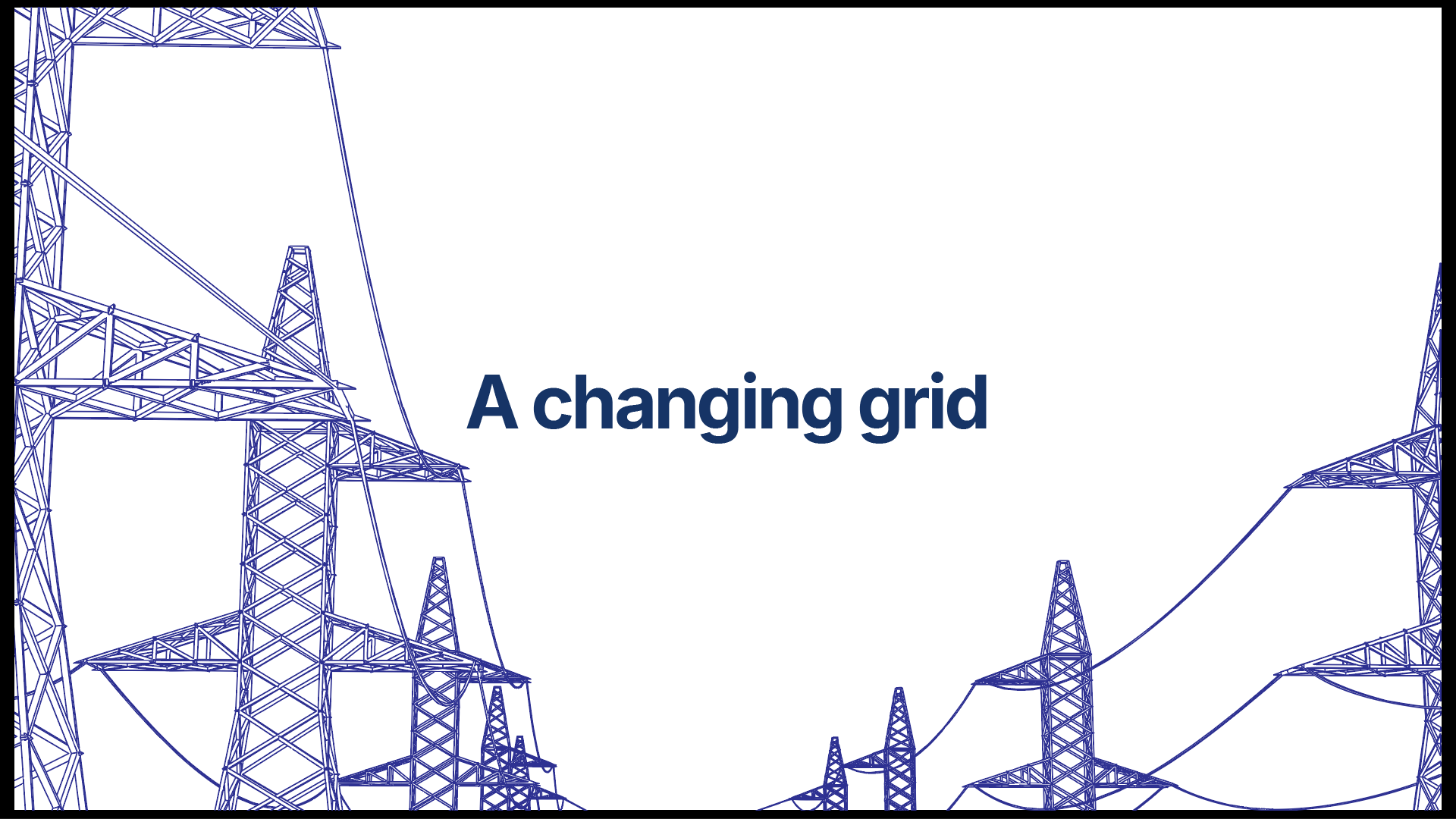







The blue color was used heavily throughout the video, mostly for text and objects or any other element on the video. The reason for this is because the company's primary color is often blue as this signifies power or rather how blue is used in the company. Most of their marketing material and ads showcase blue as their primary color. Blue also coincided well with white and yellow which is one of their accent colors. This choice was without a doubt success as it blended as the video went on.

Now we move on to the yellow color. At this section of the video was where I decided to break the monotony and introduced the somewhat yellow color. This is where I introduced the big shifts and challenges that are happening currently in the Kenyan ecosystem. Each an every challenge was met with the yellow color. The reason for this? to amplify the challenges and showcase them as a problem that's why I gave them the yellow color. Giving emphasis to them.

Another way I used the yellow color is on the text as a highlight as it turns to full blue. This was a spicing up technique to make the texts have more character instead of them just appearing in one color or only using an animation for them to appear.

The white color was another dominant color after blue. I used it because the main aim for the video was to convey a place where people come find ideas and work on challenges which is what the product is all about so white signifies peace and togetherness and makes the video feel like so. White was also used as a way to show the brighter side of the platform which is shaping the next era of energy innovation this brings all the other colors harmoniously to work together.
Going back to the purpose of the Hub in the first place it is a place where people come together for ideas, innovations, and challenges. The video was to showcase this problem or rather show why it exists. The video nailed the brief which was to capture all these and the outcome of the Hub when stakeholders meet at one place to collaborate.